USA Today produced one of the better-received news apps for the iPhone, so users were undoubtedly excited to see what the self-proclaimed nations newspaper could do with more screen real estate on the iPad. The answer is a decent-if-unspectacular news reader that, in its present form, suffers from a few too many bugs.
Money Problems: The initial release of USA Today for iPad is still a little buggy. Sometimes, pages wont load.
USA Today for iPad arrived on the App Store at just about the same time that the first iPads wound up in users hands. As a result of the constraints facing makers of these early iPad appsdevelopers couldnt get their hands on an actual physical device for testing their creations until the same time as you and memany of these offerings suffer from some noticeable bugs. USA Today is no exception, even after an update was rushed out to combat some of these problems. USA Today still hasnt stamped out all its bugsthe app is prone to crashes and, on more than one occasion in my testing, pages of this electronic newspaper only partially loaded. (The Money section appears to be the biggest culprit, at least in my experience.)
I fully expect USA Today to work out all these initial problems with its app. But even if it does, Im not sure the USA Today experience on the iPad would match what users of the iPhone app have come to appreciate. Given more screen space to work with, the makers of USA Today made some very uninspired design choices.
Start with the main interface, which is pleasant enough. It mimics the look of a newspaper, with headlines, photos, and blurbs; you can scroll up and down the page to see more stories, and tap on any story you want to read. Like I said, pleasant enough, except for those blurbsrather than a short description of what the article is about, the blurbs are merely the first sentence of the story. Often times, theyre cut offfor example, a blurb for a story on the Gulf Coast oil spill will read President Obama said today he still wants to increase the offshore production of oil, but will be careful about expanded drilling in which is where things stop. I wish USA Today would put more care into how it packages these stories.
Things dont improve much once you tap to read an individual article. Most articles feature a photo, with the text running across two columns if youre reading in portrait mode and three columns in landscape mode. (I prefer portrait, as that three-column approach feels unwieldy and narrow to me; your mileage may very.) As you get to the bottom of that first column, you may be tempted to scroll down to see more of the article. Dontinstead youll just jump to the next page. Perhaps, its an interface I would become accustomed to the more I used the app, but as it stands, it feels like a rather dull and unimaginative way to present content. At least you get the option of adjusting the size of the text.
The Straight Story: USA Todays story layoutthree columns in landscape view, two columns in portrait modeis functional, if uninspired.
All the news isnt badthis version USA Today offers several nice touches that many iPad users will appreciate. The apps home page features customizable tabs on the left side of the screen that give you the weather and sports scores. You cant drill down for more detail about a game in the scores section, alas, but tapping on the Weather section brings up a five-day forecast, local radar, and several national weather maps, including USA Todays glorious multicolor map of temperatures across the country. (Boy, Florida sure is looking orange today.) Each section features its own infographic, and the Main, Sports, and Life sections offer links to photo galleries. Life promises a crossword widget is on the way, while Money has stock-tracking features in the works.
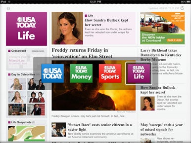
I also like USA Todays approach for jumping from section to section. Just tap the USA Today icon in the upper left cornerlogos for each of the four sections will appear in the center of the screen. Tap whichever one you want to read, and the app switches to the appropriate section.
Youll notice I said four sections there. The Tech and Travel sectionssuch a wonderful part of the iPhone version of USA Todayare MIA in iPad form. Its a grievous omission, and one USA Today should take pains to correct.
The Ol Switcheroo: Tap the USA Today logo in the upper left corner, and the app summons up four section icons for easy navigation.
USA Todays stripped-down approach to the news was a perfect fit for the iPhone and iPod touch. It could be as well for the iPad, once the developer works out the kinks from the initial release, adds some promised features, and restores some of the sections that added to the iPhone versions allure. Most important, though, Id like to see USA Today make more of an effort to take full advantage of the iPads display and screen space. Its a gorgeous device; it deserves a news app thats equally gorgeous.
[Macworld.com executive editor Philip Michaels used to spend a not insignificant amount of time each day staring at the Weather page in USA Todays print edition.]